Here are some great photos from Yahoo's photos of the week archive over the past month or so. Some of them are great examples of the elements of design and demonstrate great photographic composition. It's worth the time to look through them!
Yahoo Photos of the Week
Here is a copy of my discussion from last year about the elements of design:
Read through these, and then reread them after looking at the photographs as they will make more sense afterward:
Line: how lines are used communicate a sense or lack of depth, perspective, or flatness to an image. Imagine how converging lines create a sense of 3D perspective drawing you into a piece while a series of lines in columns creates a sense of a wall. A curvy line creates one feeling, while a line with sharp angles gives another.
Shape: shapes can be geometric or organic, but are flat elements in a piece without shading giving depth.
Texture: in photography, texture will be visual but will give the sensation of rough, smooth, soft, etc. Think of a perfectly smooth body of water versus a close up of the sand on the beach.
Pattern: Pattern can be seen by repeating elements in the piece- a series of lines, shapes, or forms that create a predictable pattern that appears as though it will continue off all edges of the photograph. For a simplistic example, think of a polka-dotted pattern on a page. You know exactly what the pattern will be if you were to extend the page in any direction by any length.
Form: Form is the concept of using shading to make a shape into a 3-d appearing object. Think of drawing a circle, but then shading it so it appears to be a sphere/ball. There is no added depth to the actual piece, but it now appears to be a 3 dimensional object rather than a flat element in the piece.
Value: Value is the gradation of tones in a piece. Think of pure white to 100% black and the scale of grays in between. This is the value scale. Traditionally, black and white photography should have a true white and a true black in the piece and a range of grays in between. Pieces that have high values (are very light) may communicate more of an light and happy or even ephemeral feeling versus pieces that are mostly low values, are very dark, that may communicate more darkness, depth, sorrow and permanence.
Perspective: Perspective is achieved by using a number of other design elements to give depth to a piece. Imagine standing on the center line of a road in Colorado that heads straight west towards the Rockies. The road is wide where you are standing, but far away, the parallel lines seem converge. The wider they are in the foreground and the narrower they are in the background gives a sense of how far away you are. Next, think of the size of elements. Bushes near you will be big, but bushes far from you will look little. Next, think of the value of elements: items near you will be darker while objects far from you will be paler. The mountains near you appear bright and colorful with lots of detail, while mountains far from you are more gray and light with less detail.
Color: There is more to say on color than I can cover in this post, so I'll keep it short and hit some major concepts. Color can be used in many ways to communicate through a piece of art. Cooler colors, such as blues, greens, deep violets, can communicate one emotion towards a subject while warmer colors, such as reds, oranges, yellows, will give an entirely different feeling. Colors will be different at different times of the day: think of the warmth of a sunrise coming up over Lake Michigan for those of us who got up early to go shoot it. The light creates warmer color tones (reds, yellows, golds, etc) than it does midday. Color can also be used as a pattern. The intensity of color, or saturation, can communicate as well. Think of a stark black and white photograph and what the lack of color communicates compared with a photograph of bright colors of various hues. Complimentary colors (those colors across from each other on the color wheel-- Red & green, Blue & Orange, Purple & Yellow) may communicate an intensity to the image while colors nearer each other on the wheel may give a more soothing feeling (Blue & Green, Red & purple, Yellow& orange). Lastly colors should be repeated throughout a piece. Use it in more than one element, in more than one place.
Friday, December 16, 2011
Monday, December 5, 2011
Björklunden 2012 Dates
FYI: So you can all be prepared, here are the dates for the 2012 seminars and when Water color is running concomitantly. I do not know what other classes are being offered those weeks yet. I will post that when it becomes available.
June 10-15
Phil Krejcarek
Creating Better Photographs with Your Digital Camera (Beginner)
July 29-August 4
Helen Klebesadel
Watercolor: The Expressive Medium
Phil Krejcarek
Creating Better Photographs with Your Digital Camera (Intermediate & Advanced)
June 10-15
Phil Krejcarek
Creating Better Photographs with Your Digital Camera (Beginner)
July 29-August 4
Helen Klebesadel
Watercolor: The Expressive Medium
Phil Krejcarek
Creating Better Photographs with Your Digital Camera (Intermediate & Advanced)
Friday, August 12, 2011
Reminder to Fill out the Survey!
This post is a reminder to fill out the 2011 class survey on Survey Monkey. The survey link was sent to your email address. If you need the link sent again, please email me privately. I don't want to post the survey link here publicly.
Also, if you are getting this post to your inbox, you have correctly subscribed. If you entered your email address in the box on the left, but did not check your email inbox/junk mail box for the email from Feedburner, you have to do that! It will send you a link that you must click on to verify your subscription and finish the sign up process. Please email me with problems/questions.
Karen
Thursday, August 11, 2011
How to Post to the Blog
For those of you new to blogging, here are some basic instructions on how to post to the blog. Go ahead and do a test post if you'd like as you figure it out. From the main page of the blog, in the upper right corner you'll see two options: Create Blog and Sign In. You want to click Sign In and then enter your log in information. Once you are signed in, it will likely take you to a screen called the Dashboard which will list at the top all the blogs you are author or administrator of. Under the Björklunden Photo blog title will be View Blog (which takes you back to the main blog page) and New Post, which takes you to the screen where you can write or post photos. Click New Post. This is the screen you will see (click to make it larger). (Make sure you see the tab entitled Compose in beige so that it's easier to work with).

The main box is where you can enter text (as you can see I am in the process of when I took this screen shot). Add a title in the title box and start typing away in the paragraph box. You can change your font, size, bold, italic, underline, color, etc, just like in Word or Pages. It will save periodically as you go, but it's never a bad idea to save it yourself here and there by clicking on the save button.
Now, let's add a photo. Look for the little icon of the photograph along the tool bar at the top of the post box. Click on it.

A box will pop up and ask you to upload a photo. From there you can Browse on your computer until you find the photo you want to upload. Often, I find it easiest to save the photo from photoshop to my desktop (in addition to the regular location in which I save it) so that I can easily find it without having to browse through my entire Pictures folder. Click on the file/photo you want to upload. It will start uploading the photo (time will vary based on file size-- it's never a bad idea to save the photo as a copy to the desktop as a smaller file size to save time and computer memory during uploading). The photo you have most recently uploaded will be highlighted in light yellow. Then click OK in that box and your photo will appear in the text in your box at the location of your cursor. There you can pick what size you want the photo to display and right, left or center justified. I recommend picking Large most of the time. It will be a small photo on the main screen, but every photo can be clicked on to see the full size. It's also not a bad idea to add a watermark to your photos so that people cannot steal them off the blog page and use them as their own. Maybe that'll be tomorrow's Photoshop lesson.
When you are done entering text/photos, click Publish Post. Then click on View Blog or View Post at the top of that next page. If you are not happy with the appearance of the post or find a typo, you can, at any time, edit your post by clicking on the little pencil icon at the bottom of your post.

It will bring you back to the Post screen with all the text and photos in place as you left them. Then just click PUBLISH POST again when you are done. You can do this as many times as you need to but will not update the time/date of the post so it will stay in order on the blog.
Have fun! Email with questions!
Test Post
This is a test post for new subscribers. If you got this post as an email in your email inbox, then your subscription is active! Likely, you will get it early morning of the day after it was posted, so for this post, it should be emailed about 5am CDT on Friday 8/12. If you're having difficulty, please let me know!
Karen
Karen
Monday, August 8, 2011
Thank you!
I also got my Canon Camera Cup today in the mail! Thank you all for the gift, but mostly for thinking of me. I certainly was not expecting the gift and appreciated the thought. I love assisting in the class and getting to share Björklunden with you all. It is a very special place to me and the friends we meet and keep make coming back worthwhile.
I miss you all and Björklunden greatly. I hope to see you again in 2012 if not before!
Karen
I miss you all and Björklunden greatly. I hope to see you again in 2012 if not before!
Karen
Sunday, August 7, 2011
Thank you


Thank you for participating in the fifth Digital Photography seminar at Björklunden.
It was a pleasure for me to get know all of you and work with you this week.
And... Thank you for the coffee mug gift! Phil
Monday, August 1, 2011
Björklunden Photography Notes: Sunday and Monday
Björklunden Photography Notes: Sunday and Monday
Terminology:
F 64 = more in focus
F 22 = less in focus
F 4= less in focus bc the smaller the number the larger the opening. It will let in a lot more light so you might need to lower your ISO
Shutter Speed: http://www.wordiq.com/definition/Shutter_speed
Camera Functions:
A (auto)- The camera picks the shutter speed, the f-stop, and the ISO (film speed- how long for the sensors to react to the light)
P (program): The camera picks the shutter speed and the f-stop
TV (time variable): stopping motion or blurring motion. You pick the shutter speed, and the camera picks the f-stop
AV (aperture variable): changing the distance in-focus (depth of field) is best done using this mode. You pick the f-stop, and the camera picks the shutter speed
M: This mode is used when you want to pick both the shutter speed and the f-stop but you have to watch the exposure scale.
The B setting (bulb) is located in the M mode after the longest shutter speed. The shutter will stay open as long as the shutter release button is held down. This setting is used for time exposures.
Random Tips and Facts:
-Fast shutter speeds with freeze your image while a slow shutter speed will blur an object in motion
- If you want a short depth of field you want a small F-stop number
Beginning students do not have a center of interest in photographs… Therefore- look for something to focus on so that your eye will be caught.
Beginning students always put the center of interest in the middle which is symmetrical balance. However… it is less interesting and it is snap shooting. Asymmetrical Balance put your center of intrest off to one side.
Beginning students always hold the camera horizontally
Beginning students always shoot at eye level. Shoot from above, below.. funky angles. You could get some SWEET shots. J
Beginning students always stand too far back. There is too much empty space
Beginning students always show the entire subject because they do not crop
Beginning students do not watch the background (the negative space). That space is just as important because you do not want to have any awkward background shots interfering with your pictures.
Beginning students do not simplify. Cut out any unnecessary elements
-Keep in mind the rule of 3rds. Asymmetry adds balance. Try to put your focus on one of the intersections of thirds while watching that your negative space works with your picture.
-Eye movement is also important because it might be a still shot but the way the lines move or objects interact can make it feel like there is actual movement. Also adds a lot of interest.
Computer Notes:
Finding pictures when you are uploading them from your camera:
- · Insert CD / memory card / card reader into your computer
- · Go to MY COMPUTER and locate the CD / memory card / card reader
- · Open the CD / memory card / card reader and you will have your pictures
Creating a folder on your desktop and putting your pictures into the folder:
- · On your desktop, right click and in the options that show up click on “create folder”
- · Name your folder and hit enter (your folder will now be on the desktop)
- · Open the folder and move the folder to the side
- · Open your pictures from MY COMPUTER
- · Select all of your pictures, right click and hit COPY
- · Go back to your new folder, and right click and hit PASTE
- · Your pictures will copy to your folder and then you can choose if you want to delete them from your memory card at that point
- · MAC is different and I am sorry- I am not mac savvy… Karen is though!
Opening your pictures into Photoshop or Elements:
- · Open your Photoshop program
- · File
- · Open
- · In your open screen select MY COMPUTER and locate the CD / memory card / card reader or go to DESKTOP and selecting the folder that contains your images
- · From there you can select any image
Creating a Flickr set
Creating a set on Flickr:
Step 1: Upload your photos to your photo stream


Once your pictures have been uploaded you can now create separate sets.
Step 2: Go to your account

Step 2: Click on Organize and Create along the top toolbar

Step 3: Within organize and create there is a sets option. Click on Sets.

Step 4: Click on create a new set

Step 5: Rename your set and give it a description on the left

Step 6: Drag your photos from below into the above gray area

Step 7: Save!!!!!
Saturday, July 30, 2011
Björklunden is Coming...
ONE DAY SEVEN HOURS AWAY!!!!!!
Tomorrow, we can complete the 12 Steps to Björklunden Withdrawal! It will be Epic!
12. Upon return, come in on Boynton Lane drive off of Highway 57 as this is the fastest and most direct route back to the lodge. Once through the door at the main entrance. breathe deeply the air of Björklunden, taking in the Björklunden smell. Greet old friends and look forward to the new ones you'll make. Sit at the unofficial photography seminar table(s) for the Sunday night meal. Settle in and begin to ready yourself for another great week of food, friends, and photography. Also, remember to wear your Björklunden Photography shirts/sweatshirts so everyone at dinner will know who the cool kids are!
See you at the Lodge for dinner!
PS. We'll be in the Lakeside Seminar room this year-- the one straight behind the registration table as you come through the main Lodge Entrance. When you get there, come say hello to us! We'll be in there setting up.
Sunday, July 24, 2011
Children's Shoes needed for Pam
For those of you who remember Pam from last year's class (Sam Szynskie's mom), she is currently doing mission work in Panama, and they need donations of children's shoes, most specifically sizes 10-2, both boys and girls. This is off her Facebook page:
On that note, see you in 7 days and 4 hours!!!!! I can't wait!
Karen
If you have access to any gently used shoes from family or even a Good Will or other thrift shop, please bring them to Björklunden on Sunday and I'll collect them for her. She will be stopping by to say hello some evening as well. They have put all their money into the mission, and don't have the funds this year to attend.
On that note, see you in 7 days and 4 hours!!!!! I can't wait!
Karen
Wednesday, June 22, 2011
Looking forward to photography at Bjorklunden!


And looking forward to seeing you all up there again. I just got back from a birding class at Bjorklunden, which was fabulous as Sam would say, but the first night was weird because I kept looking for YOU guys. I DID wear my Photo 2011 T-shirt, which was noticed. (I also wore it to a UWGB Learning in Retirement photo class in the fall--I'm like a walking billboard! :) The food, lodge and fellow students are as great as ever. I had fun taking photos of spring flowers, birds and bugs on the Bjorklunden trails and in the nature conservancy areas we visited for birding. I'm also signed up for Suzanne Rose's photo class at Bjorklunden in October. (I told Sam they should just let me move in permanently! :) See you in 38 days and have safe travels up north.
Claire Weiser
Tuesday, June 21, 2011
39 days till Bjorkulunden!

We are down to 39 days till Björklunden 2011! A number of us are counting the days. While the class and lodge have been full for a while, those of use coming back this year can complete Step 11 and prepare for Step 12 of the Björklunden Withdrawal 12 Step program. See Below. For those that ordered sweatshirts or t-shirts from the 2010 class, let's plan on wearing them Sunday evening to welcome each other back and greet our new Björklunden Photo-mates.
11. Sign up for the Photography/Photoshop seminar in 2011 when the schedule is announced in early 2011. Email all your Björklunden friends to tell them you are coming back and cannot wait to return. Begin wearing your Björklunden gear again.
12. Upon return, come in on Boynton Lane drive off of Highway 57 as this is the fastest and most direct route back to the lodge. Once through the door at the main entrance. breathe deeply the air of Björklunden, taking in the Björklunden smell. Greet old friends and look forward to the new ones you'll make. Sit at the unofficial photography seminar table(s) for the Sunday night meal. Settle in and begin to ready yourself for another great week of food, friends, and photography.
We cannot wait to see you all again and be back together again.
Karen
Tuesday, March 22, 2011
Haiti April 2010
The following photographs are from my trip to Haiti in April 2010. I will be showing these photos next week. The purpose of the show which will be in print is for fund raising for our indigent patient fund. They will be framed in simple white mattes and thin black metal frames and displayed on easels. I am looking for some feedback as to if they work together, in this order, and alternating between high saturation (scenery) and low saturation (people). Should I up the difference between the two extremes? Should I do the people in straight B&W? I kind of liked the hint of color left in the photos, but the low saturated made me stop and pause with a bit more drama than full color. As a contrast, I liked the high intensity color in the landscape photos. I alternated between people and landscape to almost make the viewer go from high to low, from one extreme to the other. What do you all think? You can post comments here or email me, which ever is easiest for you. They are at the bottom of this post, so just scroll down a bit. Thanks in advance! Karen
 |
| Photograph by Karen E Fields |
 |
| Photograph by Karen E Fields |
 |
| Photograph by Karen E Fields |
 |
| Photograph by Karen E Fields |
 |
| Photograph by Karen E Fields |
 |
| Photograph by Karen E Fields |
 |
| Photograph by Karen E Fields |
 |
| Photograph by Terry Dietrich |
Friday, March 18, 2011
Bjorklunden 2011
Bjorklunden's website is showing the week of Phil's photo class (and Helen's watercolor, and the class on Abraham) as full with no more lodging available. Commuter students only accepted from now on. Hope you got a room if you wanted to, and way to pack a class, Phil! Looking forward to it, Claire
Tuesday, March 1, 2011
From the NY Times today
As you are all probably aware, Wisconsin has been in the news. WI is now known internationally for peaceful protests happening in Madison. The NY Times did a slideshow that was published today on the protests, and I found this photograph just beautiful. I thought I'd share it as an interesting use of near-silhouette, great composition, and also unique perspective in highlighting the protesters in the capital rotunda. Click on the photo to see the full size version. I'll link to the beginning of the slideshow in case anyone is interested.
Here's the entire show:
http://www.nytimes.com/slideshow/2011/02/28/us/LAND.html?ref=us
 |
People danced, slept or meditated on marble floors, while drumbeats and chants rose into the inverted cup of this landmark’s dome. Credit: Nicole Bengiveno/The New York Times |
Here's the entire show:
http://www.nytimes.com/slideshow/2011/02/28/us/LAND.html?ref=us
Wednesday, February 16, 2011
Countdown to Björklunden Photography Seminar
It's getting closer, only:
164 days, 19 hours, 57 minutes, 58 seconds,
until Sunday, July 31, 2011 at 4:00:00 PM
Note, we now have a new countdown timer on the top right! Now you can keep up with how many days until 2011 Photography seminar. Make sure you're registered!
164 days, 19 hours, 57 minutes, 58 seconds,
until Sunday, July 31, 2011 at 4:00:00 PM
Note, we now have a new countdown timer on the top right! Now you can keep up with how many days until 2011 Photography seminar. Make sure you're registered!
Fun with Food: Photos from the NY Times
Thought you'd like to see some professional documentary photography on a restaurant in NYC as a follow up to Phil's assignment this summer of taking pictures of food. Here is a slideshow:
SLIDE SHOW: Revisiting Escoffier: Grant Achatz's New Restaurant
SLIDE SHOW: Revisiting Escoffier: Grant Achatz's New Restaurant
Thursday, February 3, 2011
Fade by Phil Krejcarek in Exhibition
Photographs by Phil Krejcarek will be on display in Sheboygan, WI as part of the Inaugural Group Exhibition through EFFJAY Projekts. Congratulations, Phil!
Artist Statement
PHILIP KREJCAREK
During the past two years, I have been investigating the concept of dreams in my work. Part of that research has centered upon memory and how it might fade, or slip away over time.
I am particularly interested in the Surrealist painters and their thoughts about the subconscious.
The Images that I have been creating are my attempts at visualizing this notion.
At first, I started with making images as light as possible, while still being able to see them. Then, I worked on how dark an image could get.
In the future, I would like to work with scale. I would like to produce images that are mural or monumental in scale.
http://www.wix.com/frankjuarez/effjayprojekts-exhibitions
Wednesday, February 2, 2011
Slate Mondrian

Karen's Mondrian made me think of the slate table that I can see while seated at my computer. Part of it is a good match! Fun to "see" new patterns in everyday things. Stay warm, Claire
Tuesday, February 1, 2011
Karen's Mondrian
Wow--amazing that you could find bark (I assume it's bark) that mimics Mondrian.
Sorry I haven't been able to find time to do any of the assignments, though they do sound interesting and challenging. Will have to try harder.--Ruth
Sorry I haven't been able to find time to do any of the assignments, though they do sound interesting and challenging. Will have to try harder.--Ruth
Reminder: How to Post to the Blog
Since Claire, Phil, and I are the only ones posting photos, I thought I'd better refresh everyone's memories as to how to post.
Click here to go to How to Post to the Blog
Click here to go to How to Post to the Blog
Making a Watermark
So, let's get started. The commands for this are the exact same in PSE or in full version Photoshop.
Open PSE (Photoshop Elements) or Photoshop and then open the image you want to work with. Make any edits you want, such as cropping, exposure, etc, till you have your "final product."
Then, select the Type tool from the tool bar on the left of the screen. It's the capital T, 9 tools from the top. Note in the image to the left that it's slightly darker gray because it's selected. (As always, click on the images to enlarge them for easier viewing).
Across the top tool bar, you'll be able to select your font. Pick one that is pleasing to you and make the size about 40 pt just so you can see it to work with it. In my screen shot, it shows Myriad Pro and 48 pt. Make sure your color is selected as Black. Note there is a black square in my tool bar. This is where you can pick your color by clicking on the drop down arrow and picking black. Make sure it's black.
Once you've typed your text, click on the Arrow tool, the top one in the left tool bar.
Okay, so now we have our text on our photo. Here's my sample:

First, grab one of the corner handles (the little squares on the corners in green) and resize it to fit what you like. Then, move your mouse arrow near the same handle until it changes into a curved arrow with two points. Click and rotate the text as you desire. Then accept that (by hitting enter or click on the green check mark. If you ever want to try it again, click the red "ban" sign instead of the green check mark. Also, to undo something, go to to the Edit menu and click Undo). When you rotate, sometimes it'll go off the photo, so just grab the line of text and move it to where you want it.
Here's my sample rotated and moved:


Go to the top tool bar where the options are File Edit Image Enhance Layer Select Filter View Window Help. Click on Filter, then click on Stylize, then Emboss.

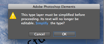
When you click on Emboss, you'll get a dialogue box asking you to Simplify the text. Click OK
If the Emboss dialogue box is covering your image, just click on the light gray bar that says Emboss, and move the box so you can see your image and text. Then, set your angle to 135 degrees, the height to 3 pixels, and the amount to 100%. You can make some small adjustments, but I don't recommend changing it by much except the angle. You can set the angle anywhere, though. When you've set your numbers, click ok. It should now look roughly like this:

Great, we're almost there. The last step is to change the opacity of the text. This is where it turns into a watermark. Go back to your layers palette on the lower right corner of your screen.
Note that just above your top layer (in this case it's my text layer), is the word Opacity with a 100% after it. Click on the little arrow next to the 100% and move the slider towards the left. You can watch it change the appearance of the text on your image. Move it to around 40% or again, whatever looks good to you. Voila! You have your watermark!

Now, with a lighter photo, you make need to make your watermark more opaque (closer to 50% or more) and with a darker photo, you can get away with a less opaque, maybe less than 30% even.
For my Björklunden friends, as always, email me with questions. I'm happy to even walk you through it over the phone, so email me with your phone number and we can set up a time over the phone to walk through it together. Have fun and post more pictures!!!
Subscribe to:
Posts (Atom)