Monday, January 31, 2011

Art Imitating Art

I'm a little slow on doing Phil's assignment from the fall, but I thought I'd post a photograph I took that mimicked the style of Piet Mondrian.

Mondrian by Karen Fields
Composition II in Red, Yellow, and Blue by Piet Mondrian
 

Monday, January 17, 2011

Bjorklunden class

Creating Better Photos with your Digital Camera will be offered July 31-August 6, taught by Phil. Full descriptions of all the classes are now on the Bjorklunden website. Hope to see you there! Claire

Sunday, January 16, 2011

Some links on Resolution

As mentioned in my post today on resizing and resolution, I wanted to find some simpler explanations on understanding resolution.  If my last post left concerning PPI left your head spinning a little, take a look at these pages:
Start here for a quick overview:
Understanding PPI/DPI


This is a little more in depth;
From Digital Home Thoughts:
First off, what is PPI you might ask? It stands for "pixels per inch". PPI is a physical measurement of how many dots are printed on a piece of paper. Ignore what you know about DPI and screen resolution - PPI is a measurement of the physical world, where digital pixels get transformed into physical dots on the page. The basic concept is this: the more pixels you can have per square inch on your page, the better the quality of your print will be.

The Painting Analogy...
Here's an analogy that might help this concept make sense: let's say you have one gallon of paint. If you have a wall that's 10 feet high and ten feet wide, you can give that wall several coats of paint and it will look great - full, lush, rich color. But if you had to paint a wall that was 100 feet high and 100 feet wide, you'd have to spread your paint very thin to cover it all - the net result would be a poor quality paint job. The concept is exactly the same when it comes to printing your digital images. If you take a low resolution (640 x 480) image without many pixels (paint) and print it at a 3" x 2" wallet size (small wall), the quality will be acceptable. But if you took that same 640 x 480 image and tried to do an 8" x 10" print (a big wall), the quality would be poor because there's not enough pixels (paint) to cover it properly.

How Many Pixels Per Inch Do You Need?
You can't have a PPI value until you know what size of paper you're printing it on - all you have is the resolution (total number of pixels). PPI is an unknown until you pick a physical print size.

If you have a program such as Picasa (or Photoshop/Elements), it will give you the PPI value for each print size that you choose.  300 PPI is ideal - anything above that is overkill. I was surprised to find, however, that I could go all the way down to 100 ppi on my 8.5" x 11" sample print image and it still looked quite good at 8.5 x 11 when viewed from a normal distance (holding the image at chest-height). At 50 PPI I could see significant image degradation. This will vary from image to image, and perhaps from printer to printer but 100 PPI is the "danger zone" that you don't want to go below. Some might argue that 150 PPI is the line never to cross - it depends on the eyes of the person looking at the image, and how closely they inspect it for flaws).

How To Resize using PSE

Ruth asked me many moons ago about how to resize photos in Photoshop Elements (PSE) as well as adding a watermark. Since I have finally installed a full version of PSE on my computer, I can answer your questions. I am using the MAC version, so if you have a PC version of PSE, it may be slightly different. Also, I have PSE 9, the latest release, so again, there may be slight differences.  I will be referring to PSE and then list the commands for full version Photoshop (PS) in parentheses after the PSE instructions. These commands are very similar in the two versions. Remember, to see the pictures more clearly, click on them for larger views. This lesson also discusses a somewhat complex concept of Resolution. I am going to find some good explanations on the web and post links. It might help to understand resolution when dealing with resizing your photographs.

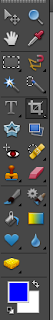
Resizing a photograph: The easiest way to resize in my opinion is using the crop tool. This will serve two purposes, it can crop your photo if you so choose or simply resize.  First, select the crop tool on the tool bar on the left of your screen. For me it is in the 2nd column, 5th tool down. You'll see it's "selected" in this photo and the box is slightly darker gray than the others.


Next, on the top of your screen you should see some options. In Mac PSE 9, it looks like this:


(Click on it to see it larger if you cannot read the type).  You'll see a drop down box at the far left where you can select your aspect ratio.  These are presets so you can easily crop your photo to a standard print size. This is pretty handy.  Note that when you select one of these presets, the next two boxes are automatically filled in for you. Width is set to 10in and height to 8 in. Great, crop away and it will give you a nice 10x8 photo horizontal photo!

"But," you say, "what if I want a portrait not a landscape oriented photo?" Easy! Note that in between the width and height boxes there is a little icon of two arrows one going each way. Click that and note that your height and width will swap. Like I said, easy! Done, finis.

So, let's add another element. If you want to make a crop that is not one of the presets, simply type in your own sizes. If you just type in a number, it will fill in the "in" for you to make it in inches.  To crop without size restrictions, just leave the boxes empty or delete the numbers you have in there.  In PS, there is a clear button just to the right which quickly clears all the number out of the boxes.

** COMPLEXITY WARNING*** If you want to resize without cropping, you can also do this, but you'll have to know the aspect ratio of your photograph. I know that my camera takes a frame that has a ratio of 8:12 (it takes photos at 40in by 60in).  So to resize without cropping, I'll want to enter in 4in by 6in, 8x12in, or some other ratio equal to 8:12). Then I just draw my crop box around the edges of the photo, encapsulating the entire photo. When I accept the crop (clicking the green check mark in PSE or hitting Enter or right click > crop in PS), the photo will stay the same composition but will be the new size.  That way, my picture will be the full frame without cropping, but a smaller version.  That is a bit more complex. If I lost ya, stay tuned. I'll explain an easier way to resize without cropping in a second.

Then, save your photo. When I crop, I usually do a Save As command and add the size I cropped to in the file name. So, "IMG_3058"  becomes "IMG_3058_8x10".

Now, for the alternative way to re-size your image without cropping.  With the file open you want to resize, in PSE, go to the top tool bar and click Image > Resize > Image Size  (for PS users, it's Image > Image Size) In this dialogue box, you'll see some options for entering free text for your image size.


You can basically ignore the first set of boxes where it asks pixel dimensions.  Generally it's easiest to work in Inches, so make sure inches are selected. You'll see my camera's default picture file size is 60 in wide to 40 in high at 72 pixel/inch (PPI). 

***Complexity warning due to technical content***  PPI is easiest defined as how many pixels your photo will have per inch. Imagine 10 dots spread over a square inch-- you'll see every dot, but you if you have 150 squished into the same square inch, you won't see the dots.  There are two resolutions we're going to talk about-- resolution for the web and resolution for printing photographs.  All cameras default to 72 ppi when it takes the photo, but if you print at 72 ppi, you'll have a horrible resolution photo-- you'll see the pixels.  For printing, we want at close to 150 minimum ppi. 72 ppi is good for web though, so perfect for uploading to the blog.  The higher the PPI, the better the resolution, but larger the file size. Generally, for photographs, you can get a good print from 150-200 ppi and a great print from 200-300. There is no value in printing over 300 ppi as (as far as I know).  So, keep in mind, that when you resize for the blog, 72 ppi is sufficient, but you won't want to resize with only 72ppi for printing. We'll get to how to resize for printing.

Resizing for the blog:
So, the first thing you want to do in this box after verifying Inches as your unit of measurement in the Document Size section, is to CHECK the box next to Resample Image.  Then, we can change the size of our image and the pixel/inch, thus lowering the file size so it's easier to email, upload, etc. So, for a blog, let's say I want my photo to be 6x9in but I don't need any better resolution than 72, so I enter 9 in in the width.  PSE/PS automatically will change the height to match to keep the proportion of your photo.  It will also keep the PPI at 72.  (note that I picked 6x9in so there is a slightly larger option for viewing when the photo is clicked on in blog posts).  Also note, that Constrain proportions is checked which means that if you enter a width, it will calculate the height for you automatically. No math necessary! :)  I don't know what Scale Styles does, but always leave it unchecked.


You can then click OK to accept the size changes.  When you do a save as, you might consider calling it IMG_3085_6x9_72ppi. Or you could make a rule that when you upload to a blog, you always save it as a certain size and to 72 ppi and call it. "IMG_3085_blog"  Now you're ready to upload to the blog.

RESIZING your photo for PRINTING:
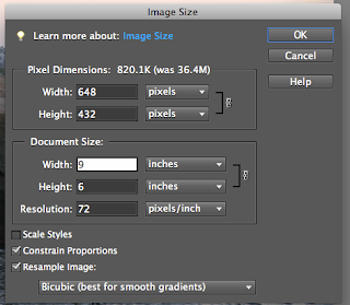
Lastly, to resize for printing, you will want the PPI to be as large as possible up to 300 (as anything over 300 doesn't get you a better print).  So, let's say I want to have a 4x6 photo. This time, do NOT check Resample image.   Note that when I put in the 6 in the width box, PSE/PS will automatically adjust the height and PPI.  Note that the resolution is now 728 ppi.
Since 728 PPI is ridiculous and unnecessary, I will change this to 300. But first, I must NOW CHECK the Resample Image box. So, put a check here and then you can type your Resolution as 300. If you do not check the box, changing the resolution will mess up your resizing measurements.

Then click OK and do a save as, again, indicating the photo size in the file name. If you do a simple SAVE command, you will overwrite your original (DANGER, WILL ROBINSON!), and if you ever want to make a bigger print, you will not be able to.  Better to always SAVE AS so that you can go back to the ORIGINAL sized file someday and recrop/resize to an 8x10 or whatever size, and not try to upsize your picture from the 4x6 file.  It'll just be of poor quality if you try to make an 8x10 from a 4x6.

***Karen's note*** When I crop, I NEVER save the cropped file as the original file name. I ALWAYS do a Save As!  I ALWAYS keep an untouched version of my original file and EVERY picture that I do a adjustment, crop, resize to, I save it to a different file name, much like I described above with the original file name with an underscore, ie. IMG_3085_8x10 or _levels  or _72dpi.  Often the new file name has a one word indication of what i've done to the file, such as the _levels.  If I level and then crop, I often add both IMG_3085_levels_8x10. That way, I can always get back to my original file size if needed. Yes it takes up disk space to have multiple versions of the same scene, but thankfully, external hard drives are cheap these days, and you can always store extra data off your computer's internal drive to an external drive. Come up with a system that works for you and stick to it. It'll be worth it if you start with a system rather than trying to go back and redo your sorting.

One more thing. If you go back to my first discussion today of using the Crop tool, you'll notice a box in the middle of that top tool bar that says Resolution.  Now that we've discussed resolution, this will make more sense.  This is an easy place to type in your resolution if you know what you want it to be. Generally, it's not a good idea to "up" your resolution, but you can "down" it here. So, if you want a quick and easy way to resize photos for posting to the blog, you can enter your width, height, and 72 ppi here. Generally, if I'm resizing anything for print, I do it in the Image Size box.  You don't want to crop a small portion of a photo into an 8x10 and tell it to be 300 ppi if that is "greater" resolution than your camera took the photo as.  The computer will add back data/pixels that weren't originally part of the photo you took and won't buy you any better resolution.  Therefore, if you are cropping and/or enlarging, it's always wise to resize in Image Size and let the computer tell you what the ppi will be based on the crop and size you've picked. If it's below 120 ppi, your print will suffer and people will see the loss of resolution. If you really want to be safe, never enlarge anything for print with a ppi less than 150. That being said, I have some prints I'll sell below that, and people can't tell the difference, but I am careful.

Next lesson (maybe) adding a watermark!  Now, go out there and shoot and upload to the blog so we can see them! Or email them to me and I'll upload them.

2011 Seminars are announced.

I was just on the Björklunden page and the 2011 seminars and registration forms are up! only 6 1/2 months till Björklunden Photography returns!!!!

Register Here

Creating Better Photographs with Your Digital Camera

July 31-August 6
Sunday-Saturday; $850 double; $1125 single; $360 commuter


Digital cameras are complex in the variety of operations they can perform. This seminar will clarify those numerous settings on your camera to give you greater control over the photographs you create and make digital photography easier. In addition, we will explore the art of photography and ways to use that camera as a tool of self-expression. Daily assignments and field trips will be offered to stimulate your imagination and creativity. These assignments will concentrate on improving compositions, portraits, close-ups, motion and night photography. In the evening, we will edit photographs and learn simple tools to enhance your images. There is a computer lab at Björklunden that can be used to download images, but students are encouraged to bring a laptop computer if possible.

Recommendations to bring to the seminar: A digital camera, the camera's instruction manual, a USB flash drive and a simple tripod.

There is a $20 lab fee to cover ink jet paper and ink.

Philip Krejcarek is a professor of art at Carroll University and chairman of the visual and performing arts department. He has taught at Carroll for the past 33 years and he is the author of the book, “An Introduction to Digital Imaging.” His work has been displayed in national exhibitions and has been included in collections at the Milwaukee Art Museum, The Denver Art Museum, Wustum Museum of Fine Arts and the Haggerty Museum of Art.

Sunday, January 9, 2011

Bjorklunden 2011

Per an email from Sam at Bjorklunden, the 2011 class listings should be on their website Jan. 18 and we should also receive a mailing about what's offered when. www.lawrence.edu/dept/bjork
Claire

Friday, January 7, 2011

Black and White Photo Slideshow

I enjoy the New York Times photograph slideshows as it gives me an opportunity to look at photos by other professionals and see what people are doing.  This one was especially poignant and I enjoyed the composition and tones of the B&W photos.  I thought you might like to look at them, too.  Needless to say, the subject matter is also quite moving.

For Alzheimer's Patients, Focusing on Comfort

Thursday, January 6, 2011

January's assignment

On the theme of composition and design elements, my challenge to each of you is to go out and shoot photos highlighting various concepts we've talked about. Pick a concept and play around with it for an entire shooting session. It could be working just on depth of field for an entire session or entire month! Or pick point of view for today and symmetric and asymmetric balance tomorrow. Pick from any in today's post or from the post entitled Caves of Vietnam.  Take photos that purposely oppose the concept, then take photos that use the concept (such as placing your subject dead center in the photo, then placing it according to the rule of 1/3s). Post both photos to the blog. Please take a couple moments to look at others' photos and leave a comment or two on your impression, much like our critiques worked in class where we highlighted what works well and offered a tip for what may make other photos even better in the future.

For those feeling more adventurous, try to find ways that make the opposite of the concept work well in a photo.  When does taking a photo with the subject dead center make a more compelling photo or communicate your idea better?  Or taking it from a straight on perspective communicate your feelings toward it more than from above or below.  Post the photo and then a description of what you were trying to do. Check back in the comments section of your post to see feedback from others.

For those with difficulty uploading, I'll work on instructions for Photoshop elements as requested by Ruth, or email me your photos with descriptions, and I'll post them with your name in the title.

Let's avoid the January blues and have fun shooting.

Going back to the Caves in Vietnam

Today, I will follow up on my post from a few weeks ago about photographic composition while looking at the same pictures of the caves in Vietnam. Think about what you want to communicate when to your viewer when you show a photograph. Then, think about how to do that through your composition. Some of the things to think about when composing your photograph are what your center of interest is, how you lead your viewer's eye through the plane of the photograph, and how to use the elements of design to make your photograph "work."


(To see images in larger versions, just click on the image)


Symmetry and Asymmetrical Balance: Phil talks in his seminar about this concept of asymmetrical balance. Let's review. Symmetry means that we basically have a mirror image on one side of the page of the other when folded down the center. In photography, we can have a mirror image, or elements of equal size, shape, or weight that create this symmetry without it being a true mirror image.  This creates balance in a photo, but unless composed very well, can be very boring. So, how are photos balanced when asymmetrical since this naturally creates a more interesting photograph? Basically, the concept is that the main interest in your photograph has a counterpart in another area of the photo, either opposite corners, opposite sides, foreground/background, etc, that keeps your interest. It could be as simple as a photo of the sun rising (or setting if you're Phil since he's never shot a sunrise) with the sun on the horizon towards the upper right background, and a small fisherman in a rowboat in the lower left foreground. It's not symmetrical, but it's balanced.

The Rule of Thirds: Here is a diagram of the rule of thirds. I

Imagine this grid superimposed on your viewfinder frame. The rule of thirds basically states that when composing your photograph, place your subject on one of the lines, either horizontally or vertically, or the point of intersection of two lines. Generally, the photo will be more interesting when composed this way than if you place your image smack dab in the middle. Think of a sunrise/sunset again, with the horizon set in the dead center of the photograph. It creates a static feeling-- equal room above and below, and your imagination does little with the image. But put the horizon on the 1/3 line from the bottom, show more of the sky, and all of a sudden, your emotions are in the photo and you see more beauty and can imagine yourself standing in front of the expanse of the sky.

Here's another example of a couple photos off my iPhone from last fall.

This photo I took, utilizing the rule of thirds that has now become 2nd nature to me.


This photo was taken by a friend who is a self-proclaimed non-artist and has never studied composition or photography. Note the difference in the positioning of the subjects and which picture is more interesting to you to look at.

Also, note the concept of asymmetrical balance in the first picture. The balloon arch at the starting line gives the photo balance and gives interest to the background, but it is in no way, symmetrical.


Depth of Field (DOF):  "Oh, yeah, I remember Phil talking about something about a big field.... wait, no, that's not quite it..." Depth of field.... easy concept, difficult to create sometimes. What is depth of field? Basically, it's what's in focus in your photograph.  Think of your photograph as a 3-d image with foreground, midground, and background. Even though it's a flat image, it's of a 3-d structure/subject and therefore, has depth. So, something with a large DOF will have most if not everything in focus, from foreground to background. Think of Ansel Adams where everything was in focus, from the land in the foreground to the moon in the background.  It's all in focus, and therefore, has a large DOF.


Now, if that's a large DOF, then a shallow DOF must be that very little is in focus.  This can be the foreground in focus and the rest out of focus, the midground in focus and foreground/background out of focus, or the background in focus and fore/mid ground out of focus. Here's an example of shallow DOF, a sample you'll all remember well.

My subject is the bowl of the spoon which is in focus, but the handle of the spoon as it comes towards the camera (technically in front of the bowl of the spoon) and the background are out of focus to the point where the background is completely unrecognizable.  This is a very shallow depth of field. Of course, there are middle points as well, where the subject is in focus and the background is out of focus, but recognizable. Depending on the purpose of the photograph, you'll pick a DOF to complement it.  Here's a picture of Peter from 2009. Note that the foreground grasses and background are out of focus, but easily recognizable. Peter, however, in the midground, is in focus. This is a shallow DOF, but not nearly as shallow as my spoon photos.

How to create DOF is another lesson in and of itself, but a quick refresher is that you use your Aperature to create DOF.  Aperature controls the size of the opening of the ring in the lens letting in light.  A large number creates a small DOF and a small number creates a large DOF. If you set your aperture to f2.8 or f4 or f5.6, your DOF will be shallow. f8 and f11 will be more midrange, while f16, f22, f32, f64 (like Ansel Adams) will give increasingly deeeeeeeep DOFs. Focal length of your lens as well as distance from your subject will play a role in DOF as well.  A longer focal length (being zoomed in) gives shallower DOF while a wide angle (zoomed "out") gives more DOF.   Also, being close to your subject will naturally give a shallower DOF while being far away will give a larger DOF.  Crazy enough, the aperture was exactly the same in my photo of Peter as it was in the photo of the spoon (f7.1), and my focal lengths were close (180mm with Peter and 200mm for the spoon). What's the difference then? Distance to subject! I was 2 feet away from the spoon, and 200 feet away from Peter. Confused yet? Just practice, and it'll start to make sense.  Remember the Aperature priority setting on your camera? This will allow you to set your aperature and your camera will figure out your shutter speed to create the right exposure.

If you're not tired from reading yet or overwhelmed (hopefully it's more review/reminders than new concepts), let me continue for just a bit longer.


Point of View: this is simple compared to DOF!  Point of view means are you taking your photograph at the same level as your subject, from below, or from above. Depending on your subject, POV will be different in making an effective photograph. Consider these snapshots of my puppy when he was just a wee thing.

The first one is taken from above, while the 2nd was taken with my lying on my belly and the camera on the floor. Which creates more interest? Usually for kids and animals, it's getting on their level and taking the photo. However, in the case of the photo on the left, taking it from above served the purpose I wanted-- documenting his length in comparison to his stuffed puppy toy and how he was sleeping half in and half out of the kennel. On the right, I got down to show how cute he was snuggled with the toy.

But when is being on the same level boring? Consider how being below or above a subject can add emphasis or remove emphasis from something. Think of a photo of someone with you standing on a ladder looking down at them? They appear smaller, shorter, less intimidating. When you are lying down, looking up at them, the appear larger than life and more dominating.  Use POV to your advantage when composing. Remember usually in portraits (people, kids, animals) you want to be on the same level as their eyes. Sometimes, though it works to your advantage to be up or down.  Play around with this concept by taking photos of the same subject from three different angles- above, below, and at the same level.

I think this is enough for today.  Here's the link to the cave photos again if you want to look at how the photographer uses some of these concepts in creating moving images of the caves.

Conquering an Infinite Cave...